Step 3: Prototyping
After I had identified a few different card categories, I jumped into Photoshop and put together some prototype cards so I could print them up and test ‘em out.
I like to get to the testing part as quickly as possible. I have this vision developing for the game, and I’m impatient to try it out, even though it’s barely half-baked. I think it’s good to have a proof of concept. Who cares if you left out some elements? It’s okay to make mistakes, especially at this stage. In fact, it’s essential. You gotta break eggs to make omelettes. Omelettes are delicious! Break those eggs!
I laid out the cards on a grid for printing. As I worked on the layout, more design details occured to me, and I was jumping back and forth between my design notes and Photoshop.
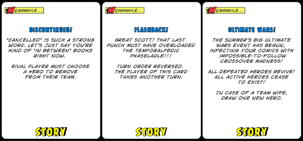
Here are some prototype Story Cards:
I printed up some sheets of prototype cards on regular printing paper. Then I cut them out into card shapes. If you’d like to use the template I made, you can download it here.
Next I bought some cheap card sleeves like the kind CCG players use to protect their Magic The Gathering cards. I picked up a standard poker deck, placed the poker cards in the card sleeves, and then slid my printout cads into the sleeves. I just ordered some like these on Amazon.
Sleeves feel a little strange to play with, but having real cards inside gives them some realistic rigidity, and you can shuffle them. And you can’t see through them.
Pretty soon I had enough cards to try out some gameplay with my kids. I wasn’t trying to play a whole game all the way through. In fact, that wasn’t really possible at first. I just wanted to see if some of my gameplay ideas held up.
As we played, I kept a notebook handy, along with a fresh pad of sticky notes. Whenever something came up, whenever I wanted to change the way a card worked, for instance, I’d write it on a sticky note and slip it into the sleeve. That way I didn’t have to keep printing up new cards.
Sometimes I go a little bit further with a card design and grab some clip art from the web just to make things more visually appealing. I don’t spend too much time on how things look, but I find that it’s a little easier to convince people to try out some game ideas when the cards look interesting. And this pays off later as reference when it’s time for an artist to get involved.
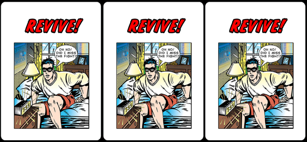
I scoured the web for some clip art, added “Revive’ in this case, slapped a mask on the character, and added the word balloon (thank you original artist!). I think this card really shows off what kind of game I wanted to make. The humor and the art style working together. Unfortunately, the Revive card didn’t survive the cutting room floor. But it was still very helpful. And believe it or not, it’s still one of my favorites.
When the game got playable, I started moving everything over to a Google Spreadsheet to share with the team. I added columns for the names, the flavor text, the card rules, and some descriptions for artists about what the cards might look like. Sometimes I was very specific, and sometimes I wanted the artist to go crazy.
Come back next week for the next installment of “How to Design Super Powered Smash Masters!”
Comments
No Comments